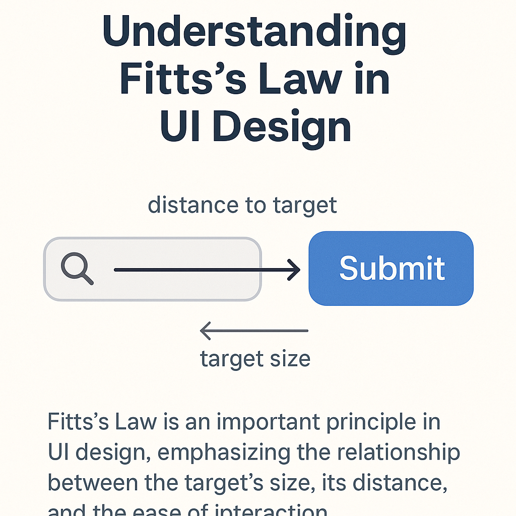
Introduction: Understanding Fitts’s Law in UI Design
For digital products, Fitts’s Law is one of the most important principles for user interface (UI) and user experience (UX) design which goes underappreciated by users. Fitts’s Law is a model that predicts human movement, especially the time it takes to move towards and select an item. Proposed by psychologist Paul Fitts in 1954, the law states that the time to acquire a target is a function of the distance to and size of the target. Selecting a target becomes easier and faster when the target is closer and larger.
In the context of checking a button in an app, website, or any digital device, why is Fitts’s Law relevant? Because buttons serve as some of the most common interaction interfaces. Every single second spends accumulating while trying to click, press, or even tap on something is a waste in a modern society where time is scarce. Stressful poor design can only make the user abandon the task altogether.
Alright, let’s get real about Fitts’s Law and why it’s actually a big deal when we’re talking button sizes and where you plop ‘me on the screen. We’re not just needing out on theory—it’s the difference between users zipping through stuff smoothly or rage-clicking because some tiny button is floating out in the Bermuda Triangle. I mean, user efficiency? Accessibility? That’s the good stuff that makes your app not suck. I’ll call out some boneheaded blunders designers still make (yes, even pros drop the ball sometimes) and drop some sanity-saving tips so you don’t have to learn it the hard way. Whether you’ve been pixel-pushing for years or you’re just starting and still Google what “UX” stands for, seriously, stick around—if you want users to not throw their phones, you got to get this principle down.
Importance of Fitts’s Law in User Interface Design
you know, Fitts’s Law isn’t just some nerdy jargon buried in design manuals—it’s basically running the entire show every time you poke or swipe at your phone. Click a button, drag a slider, even that moment you miss a tiny close icon for the millionth time? Yep, you’re butting heads with Fitts’s Law. The gist is dead simple: if a button is big and close, its way easier (and faster) to hit. Who would’ve guessed?Here’s the deal—when designers sweat over where to stick a button or how chunky to make it, they’re doing a whole lot more than picking a pretty shade of blue or chasing some trendy minimalist vibe. Go too sleek or dainty and boom—users start fumbling, cursing tiny targets, wondering why designers hate them. Small stuff in weird spots? That’s asking people to do finger gymnastics, and trust me, nobody signed up for that
And yeah, it’s not just about convenience. Think about folks with shaky hands or older people who don’t have the finger precision of a twelve-year-old Fortnight champ. Design choices here mean the difference between “Hey that was easy” and “I give up, smash the phone.” Skipping over Fitts’s Law basically means leaving people out in the coldMobile and Wearable’s? That’s where it really gets spicy. Teeny screens, chunky fingers, not enough real estate—all those little taps matter now more than ever. Designers got to juggle fitting stuff in without making users feel like they’re trying to hit a moving target on a postage stamp.
Bottom line? Fitts’s Law isn’t about making things look fancy. It’s about making them feel snappy, easy, and almost invisible—like, “Wow, that just works.” And honestly, if your UI nails that, you’re winning. Everything else is just pixels and fluff.
How Fitts’s Law Influences Button Size
alright, let’s cut to the chase: Tiny buttons are the worst. Nobody’s got time to play “Operation” on their screen just to close a dang pop-up. Fitts’s Law (yeah, it’s a real thing, don’t roll your eyes) basically says the bigger the button, the easier it is to hit. Like, duh, right? It’s especially key if you’ve got people with all sorts of abilities using your stuff, or if folks are in a rush.
Bottom line? Fitts’s Law isn’t about making things look fancy. It’s about making them feel snappy, easy, and almost invisible—like, “Wow, that just works.” And honestly, if your UI nails that, you’re winning. Everything else is just pixels and fluff.
How Fitts’s Law Impacts Button Placement
Placement is the same as size. According to the Rules of the Fits, the distance between the initial point (often mouse or finger space) and the target button matters. The further button takes the longer time to reach. This is why strategic placement is important in user interface design. Let’s see an example: Ever note how the most important buttons in the top-right corner on mobile apps or websites usually have? It is not random. These are areas that users move naturally. On mobile, most people are right-handed and use their thumbs, so the bottom placement is faster and easy to reach. The buttons should be kept where users expect from them. When you go against those expectations, you make friction. For example, if a ‘submit’ button is kept far away from the form that is kept, users have to find it, which slows them down. Worse than that, they can remember it completely.
Additionally, proximity to other elements. If a button is very close to another clicking element, users can accidentally click the wrong. It is particularly troublesome on mobile, where screen space is limited. Good placement also considers the user flow. The button should be aligned with the natural direction of reading and action-usually the top-to-low or left-to-rights. Following these patterns reduces mental efforts and speeds up interaction. Finally, the effective button placement creates an easy experience. This makes the interface feel comfortable and responsible, which keeps users busy. Ignoring this aspect causes disappointment, mistakes and potentially losing users.
Designing for Touch Interfaces: Mobile and Tablets
Touch interfaces add another layer of complexity to the rule of fits. Due to no cursor to guide the working tasks and fingers, designers should take even more care about button size and placement. Unlike desktop environment, where precision is high, mobile users rely on their fingers, which are very less accurate. The button on the mobile and tablet screen should be large enough to adjust a range of finger shapes. According to Apple’s Human Interface Guidelines, the general recommendation is at least 44×44 pixels. This ensures that most users can comfortably tap on a button without killing adjacent elements.
The thumb area in mobile design is another major concept. Studies have shown that users mainly use their thumb when operating the smartphone, especially by one hand. This means that the lower center and the right edges of the screen are most comfortable to reach the area. Placing the primary button within these areas makes the interface feel more ergonomic and fluid. On pills, the situation varies slightly due to large screen. However, the main principle remains: large touch targets kept within easy access improve the purpose. Designers have to take care of how a user keeps the device-with a one-hand, two-hand, or stylus. In all cases, touch response cases also. Users are expected to confirm visual or touch that their input has been registered. When combined with appropriate size and placement, these signals feel responsible and reliable to touch interfaces. Designing for touch is about creating an environment where users do not think very hard. The rule of fits helps to simplify these options, guiding designers to create experiences that are both spontaneous and delightful.
Accessibility Considerations and Inclusivity
Accessibility is often seen as a special area, but in fact, it should be integral to all design. Fit’s law plays an important role in making digital experiences more inclusive. When we design buttons with proper size and placement, we are not just making things easy – we are making them possible for a wide range of users. Consider motor loss users, such as Parkinson’s disease or arthritis. Small, tightly packed buttons can be incredibly difficult to interact with them. By implementing the Rules of Fits, we ensure that these users do not struggle unnecessarily. Large buttons reduce the need for precise movements, forgiving the interaction more. Elderly users also benefit from well -shaped and proper buttons. With age, both mastery and vision may decline. Making the button big and making them a position where they become easier, reduce frustration and increase the rates of completion of work. Let’s not forget the temporary loss – such as trying to use one hand phone while carrying something, or operating a touchscreen in a moving vehicle.
Good design also adjusts these scenarios, proving that accessibility is not only about disability – it is about variability in context. Salah designs are often naturally aligned with good designs. When you make your interface easier for someone with disabilities, you usually make it better for everyone. The rule of Fits provides a scientific, user-centered structure to achieve this. Including access to the start avoids the expensive reverse and ensures that your product can reach the broader audience. This is not only moral – it is a smart business. Everyone wins when the interface is designed with inclusiveness keeping in mind.
Common Mistakes Designers Make Regarding Fitts’s Law
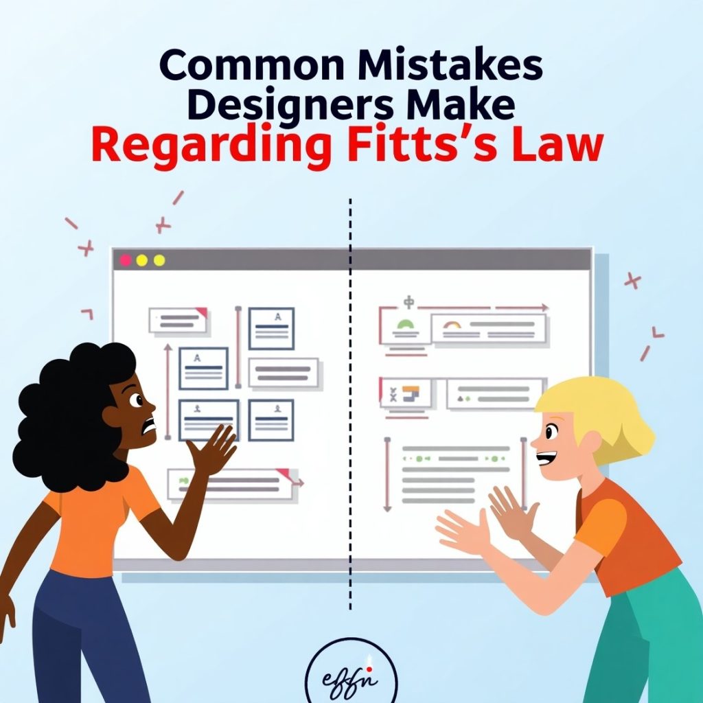
Despite its importance, the law of the fits is often misunderstood or ignored, especially when beauty options take precedence. One of the most common mistakes is to design button which are very small. In the discovery of smooth minimalism, designers often sacrifice the purpose, forget that the style should not be trumped. Another miss is a bad placement. Keeping the required buttons in the hard-to-catering or unexpected areas forces users to hunt, disrupt the flow. This may look visually attractive in a layout, but if it is not comfortable, it fails the user.
Crowd is also a frequent issue. When too much clicking elements are taken to a small location, users can easily click on the wrong thing. This is especially problematic on mobile devices, where it is difficult to achieve accuracy. Ignoring the user’s reference is another disadvantage. A desktop design does not automatically translate well into mobile. A comfortable clicker with a mouse can be a bad dream on a small touchscreen. It is necessary to adopt button size and placement in devices. Some designers also forget about the visual response. When the users tap on a button, they have to know that it has done this work.
A button that does not react visually can cause frequent clicks or confusion, different from experience. Remedy? Test with real users. Can’t work in behavior what looks good on a mock-up. The law of Fits is not a suggestion – it is a proven guideline contained in human behavior. After this, creativity is not reduced; It channels it in the right direction.
Conclusion
Appreciation and implementation of the rule of Fits can lead your designs to excellence. It’s also a reminder that design is not just about the appearance of things, but about how they work. Focusing on buttons position and size helps you improve overall user experience, reduce errors, and enable digital interaction.
The beauty of the law of Fits is that it is based on real human behavior. It is not a gimmick or a fad – it is science. And it gives you a model for making better decisions. Whether you are designing for desktop, mobile, tablet, or even smart watch, theory still applies.
As a designer, your task is to take away friction, not introduce it. Each tap, click and gesture must feel natural. Users shouldn’t think about where or how to go and do something – it simply has to work. This is the crux of good UX, and the law of the fit assists you in getting there.
So the next time you are adding a button or checking its size, keep in mind: this is not a tiny detail. This is a significant element of the user experience. Design with intentions, guided by principles like the law of Fits, and your users will reward you – perhaps not with words, but obviously how they interact with your product.