Introduction
The current trend in web development has brought front-end layout designing to a sophisticated and flexible level. CSS Grid has emerged as one of the most powerful layout systems any developer can use in modern web design among the tools that define the dramatic change of web pages. In contrast to older systems-such as floats, and even Flexbox (which is largely one-dimensional)-CSS Grid allows two-dimensional layouts, which enable the management of both columns and rows quite seamlessly. Therefore, as a full-stack developer juggles all aspects of an application-from the front end to the back end-it is worth acquiring the skill that will come in handy in using CSS Grid effectively for cleaner, more maintainable, and performance-oriented layouts.
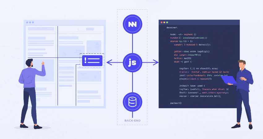
CSS Grid, inside full-stack development, completes the journey from backend logic and knowledge to the final user experience. Typically, backend systems could be responsible for data structure as well as logic, but the frontend more often defines the way in which this data is presented to the user. With CSS Grid, developers can create responsive layouts that automatically adapt to different screen sizes and adjust to varying content loads, all without resorting to overly complicated markup or JavaScript-based layouts. If applied correctly across a full-stack environment, Grid not only creates better design consistency but also improves maintainability and scalability in web applications.
Understanding CSS Grid Basics for Full-Stack Developers
What Is CSS Grid and How It Differs from Other Layout Systems
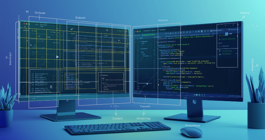
CSS Grid is a two-dimensional layout system in pure CSS by which one can completely control the rows as well as columns in a layout. In comparison to flexbox, which makes it easy to control items in one direction (thus only- row or column), CSS Grid has the ability to align items with respect to both axes at the same time. This makes CSS grid an excellent candidate for the design of complex page layouts, such as dashboard, gallery, and multi-section layouts. From the perspective of a full-stack developer, dealing often with environments where an entire application has to be built, including UI and UX with high consistency, CSS Grid could be considered a high-level abstraction that brings a significant reduction in “boilerplate” code and greater predictability in layouts.
CSS Grid’s most noteworthy characteristic enables creation of grid templates via such properties as grid-template-columns, grid-template-rows, and defining grid areas corresponding to various sections of the layout. It enables developers to map a layout structure as one would in wireframes or design tools. At the same time, Grids boast functionalities more responsive than any legacy method could hope for. Use minmax(), auto-fit, and auto-fill to create an all-powerful adaptive grid that will adjust to the screen without fat reliance on a media query. This is primarily beneficial for full-stack developers that build wholly responsive components, which need to behave similarly across devices.
Why Full-Stack Developers Should Care About CSS Grid
Full-stack programmers are considered the connecting link between front-end and back-end development. Many times, a full-stack programmer has the job of creating APIs and presenting the data through an elegant, intuitive interface. While working with CSS is generally deemed a front-end task, CSS Grid as a layout technology is important for full-stack developers because it can greatly improve UI design while remaining within the confines of the code they have wrought. With CSS Grid, these developers can create intelligent and dynamic layouts right from data received from the server, putting them in a position to avoid off-the-shelf libraries or heavy frameworks that render the app useless.
Moreover, because full-stack development heavily relies on modularity and reusability, CSS Grid happens to immediately fall into the paradigm of component-based architecture that pervades modern front-end libraries-such as React, Vue or Angular. CSS Grid components can easily be reused on multiple views or routes, producing identical layouts with much less redundancy. This is essential in scalable applications where layout structure has to remain constant, while content changes dynamically. CSS Grid’s rule-based design goes hand in hand with modern styling solutions including, but not limited to, CSS Modules, SCSS, or even Tailwind CSS, allowing developers to maintain clean, structured, and readable CSS. Thus, all of this makes CSS Grid not a mere design tool, but a whole-stack productivity booster.
Implementing CSS Grid in a Full-Stack Workflow
Creating Responsive Layouts from Server-Side Data
Much more common when it comes to developing full-stack apps is the dynamic layout generation based on the server-side data. For example, e-commerce might need to render on-the-fly product cards received through a back-end API. Flexible grid containers can be defined by the developers using CSS Grid based on the number of items returned from the database; in this case, laying a container with display: grid and setting grid-template-columns: repeat(auto-fit, minmax(250px, 1fr)) would allow for responsive grid display depending on item count or screen size. All of this helps in reducing pagination or fixed columns in design, imparting a dynamic and engaging perspective to the user interface.
However, full-stack developers do not define layout logic in the server; rather, this gets passed data items that are then organized visually via CSS Grid for the frontend. Thus, it minimizes the thinking in server logic. Besides, it allows the same layout to be reused for other data types or models. So, it doesn’t matter whether you have an array full of blog posts, images, or dashboard widgets-the grid layout comes back the same way. This brings along the reusability of performance, simplifies styling logic, and would lessen the demand on complex conditional rendering. With such flexibility in maintaining full-stack systems, a lower number of bugs pop up, implementation is fast, and overall developer experience gets better.
Using CSS Grid with Front-End Frameworks in Full-Stack Projects
From these add-ons, for instance, in their subset editor environment, full-stack projects today utilize front ends like React, Next.js, Vue, and Svelte, while backend RESTful APIs provide data for applications. CSS grids are being integrated with these frameworks, making them very easy to use. Such that, in React, developers can just create reusable Green-Light components like <GridContainer> or <GridItem> with scoped CSS or styled-components, thereby managing layout rules reasonably at detailed, but controlled scores. As API data is consumed by these components, through props and utility classes, the grid rules can be applied dynamically, yielding a completely modular system that can be reused across different views.
Within Vue and Angular projects, directive and binding syntax enables the easy dynamic population of grid areas via loops and conditional rendering. Thus, product-objects-matrix-backend arrays can be bound to grids; with each product displayed in its <div> styled by grid-column or grid-row. Hence, separating logic according to viewports and types of devices is unnecessary for the developers. This is how CSS Grid combined with scripting within the declarative nature of modern JavaScript frameworks produces clean code, faster development, and really improved flexibility for programming complex responsive UIs. Integrating all this as a full-stack developer makes it possible to deliver completely functional features on minimal friction, from database to browser.
Advanced CSS Grid Features for Full-Stack Use Cases
Grid Template Areas for Clean and Semantic Layouts
Grid-template-areas of CSS Grid deserves special mention as a powerful yet underused feature. This facilitates assigning named areas to parts of the grid. This semantic and human-readable layout logic will be especially beneficial in any full-stack projects. Instead of using the nth-child-based selectors or hard-coded row-column numbers, you can define scene names: header, nav, main, and footer. These areas can then be reused and repositioned, modifying the layout based on whether the structure or content comes from the back end.
This is mostly applicable to server-side templates or content management systems. These set up areas on the dashboard for components like charts, tables, or status cards to appear, but they may conditionally render based on user roles or data. In other words, if such areas were mapped to named grid areas, it would be very easy to modify content on-the-fly without having to hassle too much about modifying the layout’s structure. Moreover, this would help CSS maintainability and collaboration among designers, front-end, and full-stack developers since there is a shared understanding of what each part of the layout does, while getting too deep into the code really is not needed.
Nested Grids and Dynamic Layout Adjustments
The increasing complexity of full-stack applications entails an increasing demand for various layout options. Typically, plain grid layouts are not able to fulfill the design needs of a particular multi-functional application. This calls for nested utilization of grids. This refers to a grid placed in an item of a grid belonging to another grid. Through this method, layout distribution can be controlled further, particularly in cases where dashboards, portals, or content-heavy web applications are concerned. For example, a main layout area may display a cluster of cards, each of which uses nested grids to align text, images, and buttons therein.
Nested grids encourage modular layout logic for developers. Instead of writing deeply nested HTML structures or writing complex flex rules, full-stack developers use a smaller component that defines its own layout logic. It makes the result of dynamic content rendering more predictable and manageable using third-party APIs, user-generated content, or multilingual data moving between spaces or alignment. The combination of nested grids and the component-based architectural approach leads to a clean separation of concerns. Every entity shall be responsible for its own visual hierarchy and should not depend on global styles or hacks situated within a parent container. Nested grids help maintain the structure and design consistency of an application for full-stack developers working on end-to-end functionality.
Best Practices for Full-Stack Developers Using CSS Grid

Maintain Separation of Concerns with Component-Based Grids
The separation of logic, layout, and data is of great importance in full-stack development. The component-based CSS Grid has been particularly strong in this respect. Using component-based design, developers should keep the grid styles really contained in their components, rather than mixed with the HTML or JSX. This will protect layout change from affecting how the application’s business logic or API data is processed. Example: the <UserCardGrid> is a part that handles rendering and styling to structure layout, and higher-level components sit between that and fetching or state management activity as the simple application core looks after those activities.
The encapsulation of layout logics within components makes testing and debugging easier. This helps isolate problems occurring with the grid such that they do not reach out to the global application while style changes on a component do not affect the rest of the UI. Such modularity is relevant for full-stackers, where several developers work on the front and back end. They enable scalable and maintainable use of CSS Grid in such component systems through using CSS-in-JS, Tailwind CSS, or CSS Modules. Through these best practices, full-stack developers will be able to create consistent and high-quality user experiences with reduced technical debt.
Optimize for Performance and Accessibility
While the layout capabilities of CSS Grid are remarkable, full-stack developers should be mindful of performance and accessibility. From a performance perspective, pure CSS Grid layout minimizes heavy-duty JavaScript layout manipulations that incur a lot of resource overhead and slow down rendering times. The more you rely on built-in browser capabilities, the higher the loading speeds of apps, and the more seamless the transition to adapt to different sizes of screens. Also, modern browsers provide great support for Grid and polyfills for the older versions; hence compatibility is ensured.
Thus, accessible-wise it becomes important here to bridge the two worlds of semantic HTML and CSS Grid. Developers should limit their use of div tags and apply available tags, such as section, nav, header, article, and footer, to represent grid areas. This activity will promote understanding of the content structure from the screen reader and assistive technology perspectives. Additionally, a logical tab order, proper contrast ratios, and lack of visual rearrangement that goes against the logical reading order will have to be taken care of as well while using Grid. By building accessibility into the layout design process, full-stack developers can ensure their applications are inclusive and functional for all users, regardless of how they interact with technology.
Conclusion
CSS Grid is beyond a simple front-end utility; it is one of the blessings for full-stack developers to develop well-structured, responsive, and scalable web applications. CSS Grid helps in everything-from making layout designing easier to improving responsiveness and the management of components-all in the evolution of high-quality user interfaces that blend seamlessly with back-end systems. Be it an application that pulls data from a server, render dynamic dashboards, or implement multi-column layouts; a good command over CSS Grid may revolutionize your layout architecture methodology.
It utilizes CSS Grid in a way that makes its full-stack journey seamless and enables developers to deliver on the maintenance of layouts consistent scaling without compromising performance and accessibility. From grid-template-areas to nested grids and responsive sizing, it has got all the layout flexibility that is necessary in an agile development environment. Full-stack developers will therefore be able to use those skills to meet better the increasingly visual and structural demands of modern applications as web development continues to evolve with CSS Grid in their toolkit. Indeed, they are not only building functional software; it makes the user experience more efficient and elegant.