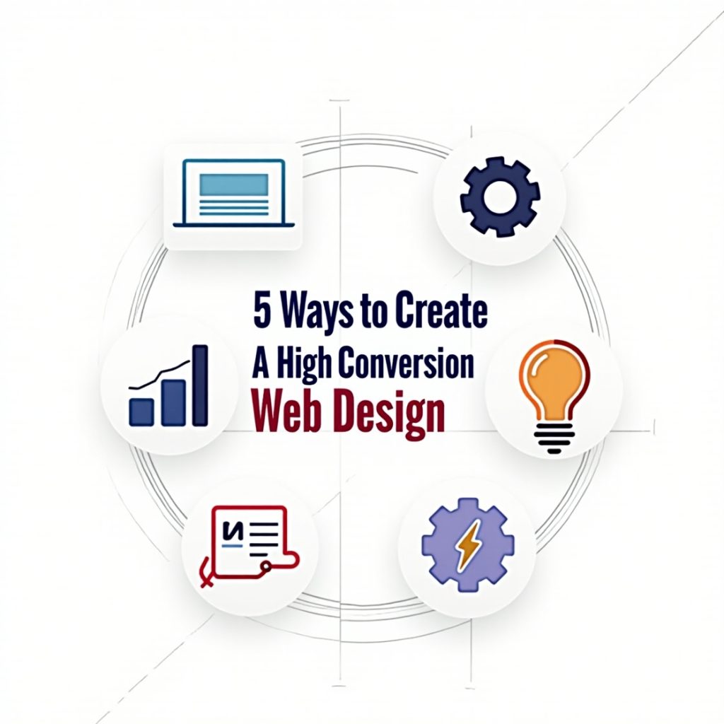
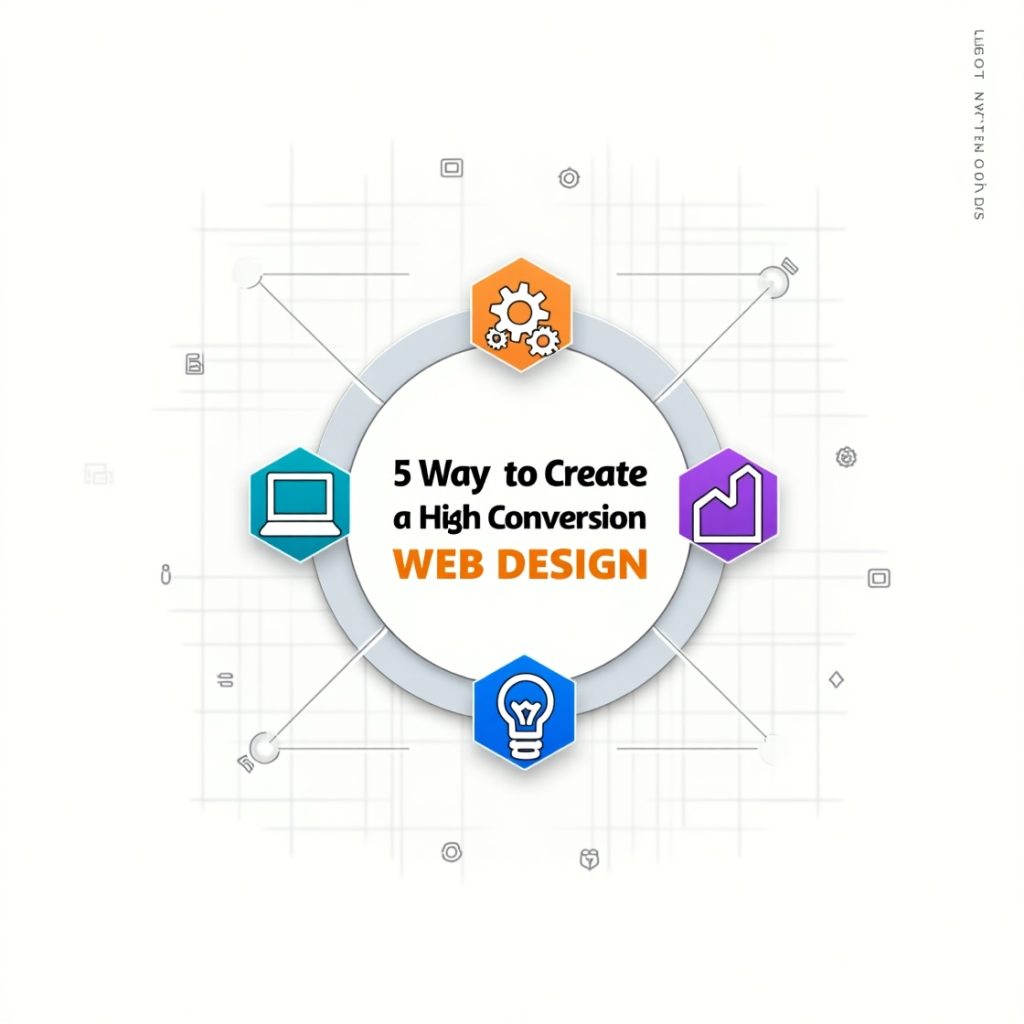
1. Priorities Simplicity and Clarity in Layout
Simplicity, therefore, is not just about being ordinary; it is about being functional. A clean interface naturally conveys to the user that they have arrived in the right ecosystem. Moreover, this is one of the fastest ways to improve a website’s conversion ability. Clear navigation, clean visuals, and crisp messaging draw people in. When your design has a clear space and the message stands out, there is no guessing for the user about what action to take next; it is utterly intuitive.
Reasonably, clarity in layout also translates into speed and performance. Simple designs result in faster loading, which is extremely important, as nowadays, people take mere seconds to decide whether to stay or bounce. Trust is developed through good design, and trust is what drives conversions. You don’t need to be slick. Instead, focus on one idea for one screen and let it breathe. Let your CTA speak for itself.
Good design doesn’t show everything at once; it shows the right thing at the right time. The use of white space must be done wisely to highlight headlines and buttons. Maintain logic in your flow. The user should feel gently guided through an experience rather than thrown into the depths of a maze.
Use Consistent Visual Hierarchy
Visual hierarchy is like storytelling; it tells where visitors should cast their gaze first, second, and last. Eyeballs follow expected patterns when they hit your website. Confusion arises if your design is not following a story. Whereas if font sizes, colors, and placements are intelligible, then paths are sure.
Then have your headlines be bold and eye-catching, and sub-headlines lead into a smaller text to get people deeper into your content. Buttons should pop instead of competing against the rest of your palette. CTAs should be the same color and shape throughout the site to create a familiar feel.
Images and icons can also harness the way attention flows, but they have to do something on their own. A visual hierarchy is an exciting-cool balance. It excites the user to keep on clicking but is never overwhelming. The aim is to make it comfortable for your visitors to say-“yes”-by easily making the next step clear.
2. Design With the User Journey in Mind
Gorgeous high-performing websites have meanings and purposes behind their designs. Each page should be linked to the overall journey of the user. If a person is coming into your site, be it from a homepage, a blog post, or even a product page, he should see what your design anticipates with respect to his needs. Picture it at your site as a conversation. What is the first thing a visitor should hear? What question will that visitor ask next?
User intent mapping minimizes frictions. For instance, if you are selling a service that is to be bought, don’t have the “Get a Quote” option buried three scrolls deep down. Make it prominent. If he is doing his research, then make references to useful guides or case studies easy. A good user journey caters to both cold and warm prospects, providing value wherever necessary.
Design is immutable. As one learns more concerning the use site visitors make of the site, layouts, CTAs, and content may be altered to give more direction toward one’s expectations. Even location benefits or interest details add personalization that greatly increases conversion.
Streamline Navigation Based on User Intent
Navigation can be considered the most direct way to help visitors find something without even thinking about what they are trying to find. Visitors would leave if they had to dig through menus to find the right link or guess at where it leads. A clean, uncomplicated menu-sone user-centered-is going to keep users engaged and moving on.
Top-level navigation must be limited to essentials. Dropdowns should be few and far-used for their proper purpose. The biggest disaster of all? Too many options. When people become overwhelmed, they either freeze or bounce.
Use analytics to know what people search for most often, then create a prioritization of those items in your menu. If you’re into using sticky headers, as your visitors scroll, the navigation would follow them and make it really easy for them to jump to another part of your site without losing the current momentum. Label buttons or menu items properly: no clever puns or brand jargon required. “Get Started” is more useful than “Unlock Potential.” Speak your user’s language, and guide them with clarity.
3. Optimize for Mobile Responsiveness
In a nutshell, failing to have an elegant site viewed on a mobile phone would end up losing you a customer or two nowadays; that really means that having a mobile responsive site is no longer optional-it’s definitely a necessity! A high-converting web design automatically adjusts its layout, fonts, images, and buttons in accordance with the screen size. Not just for aesthetics but also about usability.
Think about how people use their phones: often, they multitask and thumb-scroll and want to get to the information relatively quickly. Hence your mobile design, therefore, needs to be optimized for fast loading, upfront important information, and large tippable buttons.
It also refers to compromising, if not majorly, your SEO rank because search engines prioritize mobile friendly sites. So, it is not that user experience is to be considered; it is also about visibility. It ensures that a person is taking care of all types of visitors.
Improve Touch Interactions and Page Speed
A mobile experience is not limited to the size factor; rather, it plays with the concept of intelligence. Easy-to-tap buttons, intuitive form-filling, and super quick-loading content are the icing on the cake when it comes to conversion rates. Tiny buttons with slow-loading pages guarantee the loss of potential customers.
Do not overstuff the screen. Allow space for each section. For content deemed unnecessary at first, try using expand/collapse menus or accordions. Finally, CTA buttons should be mobile-friendly and have a good size and placement where one’s thumb might easily rest.
Then there is speed. Slow mobile loading times would kill conversion. Optimize your images, use caching, and minify code. Google PageSpeed Insights is a great free tool to check what is slowing you down.
4. Use Trust Signals Throughout Your Design
Trust is the pillar of conversion; if a visitor does not feel secure, he will never click the words “Buy Now” or “Contact Us.” In your design, trust should be established both in obvious and in subtle ways. Obvious signals are security badges, testimonials, and logos of client companies. A few subtle signals include consistent branding, clean visuals, and professional typography.
We humans are social creatures. If we see that others have had a positive experience with something, it lessens our inhibitions to try it. That is why reviews, star ratings, and social proof are so effective. Place them around your site strategically-in the middle of call-to-action buttons, at bottom of product pages, or even in sidebars.
Also, do be transparent. Just tell users what information is being collected, when it is being collected, and how it is protected. Add the following to your site – a link to your privacy policy at the bottom, SSL certificates, and contact details to reassure users, thereby converting them.
Leverage Testimonials, Reviews, and Real-World Proof
Indeed, social proof doesn’t have to be loud to make an impact. Simply inserting a quote from a happy client or a simple statistic about your success rate can nudge users towards a decision. It’s not really bragging but giving them reassurance that it’s not just you who’s trusting you. You can even use video testimonials, which is very strong. So they see a real face. And then name, photo, and obviously company logos (with prior permission) to enhance your credibility. Don’t generalize things like “great service.” Instead, put specific results here: “Our site traffic increased by 40% in two months.”
But, you can also show figures-how many people signed up, the number of projects you have accomplished, or in some cases, live numbers of visitors. Creating urgency makes it clear that your brand earns the trust of others.
5. Test and Tweak Based on Real Data
A website won’t convert if regularly tested for optimization. Design comprises half of the battle; the other half is performance tracking and improving upon what people do and not what one imagines. Start with A/B testing; the comparison of two versions of a landing page, headline, or CTA will let one know which version performs better. That kind of data takes the guesswork out and truly defines what drives all conversions.
Use Google Analytics or Hotjar tools to pinpoint drop-off locations. Perhaps users are clicking but not submitting forms; perhaps the wording is poor or containing buried CTAs. These insights will allow minor tweaks to create enormous results.
Analyse Heatmaps and User Feedback
Heatmaps show the full history of a user’s clicking, scrolling, or mouse hovering activity. It’s almost like x-ray vision for your site-infiguring out things that are working and not working. If the users have ignored your main CTA or are getting stuck somewhere that you haven’t anticipated, you can easily know where to focus.
It should be correlated with real users’ observations. A pop up survey- feedback forms are surprisingly insightful. Try asking a simple question: quotation mark close quotations. “What prevented you from signing up? “Did anything confuse you?”
This will help improve your content and layout across the site, as well as your navigation. The idea is to be curious and also to allow one’s self to change. Web design high conversion doesn’t end here-it keeps going endlessly: listen, test, and keep improving.